

Design a User Experience for Social Good & Prepare for Jobs Course Journey Week 2


This is the second article in the series. If you haven't read the first one, Here it is.
In this article, I will talk about the second week of the course. I will continue with the ideate phase and then the testing phase where I will do a usability study.
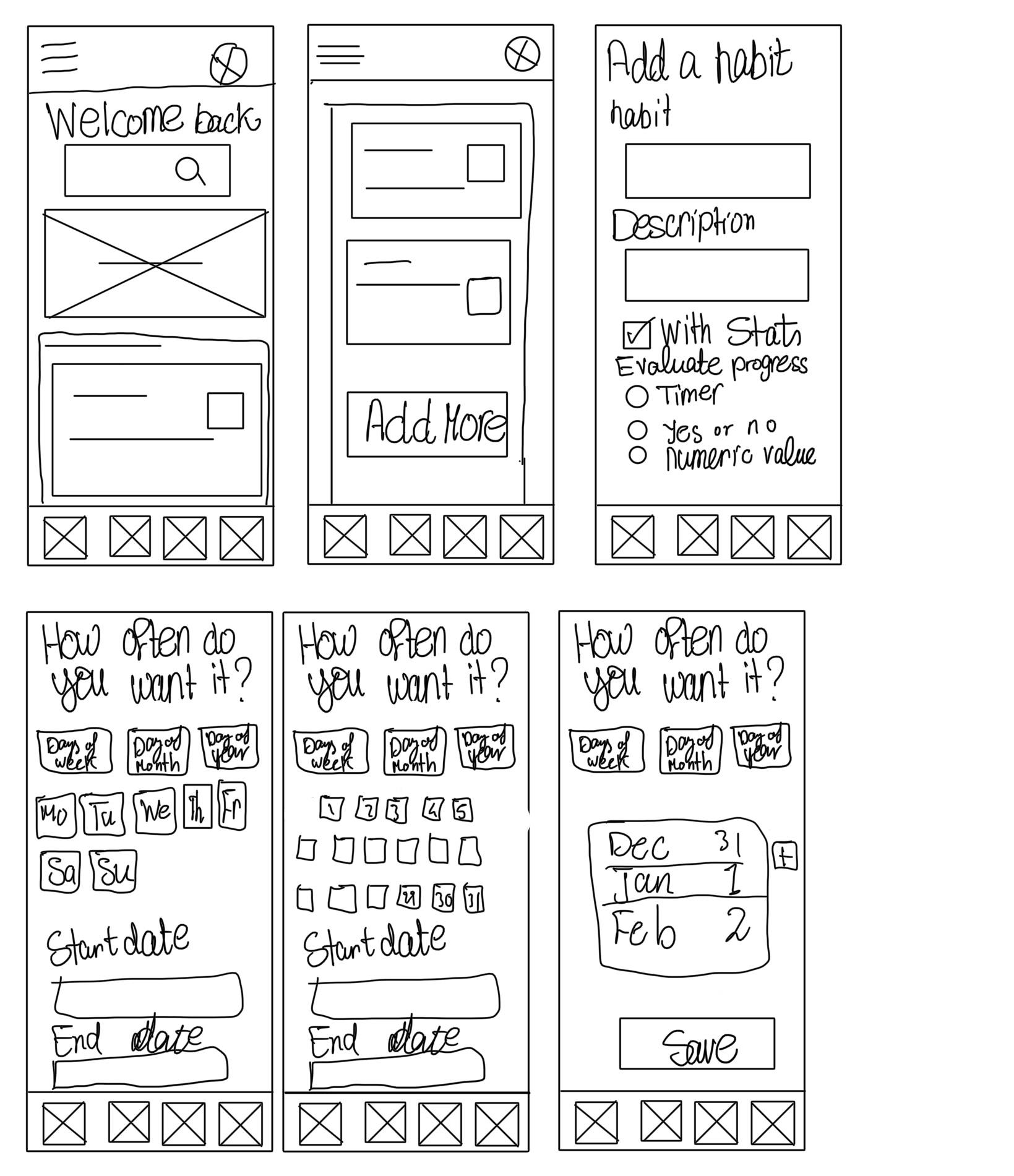
Sketching the wireframes
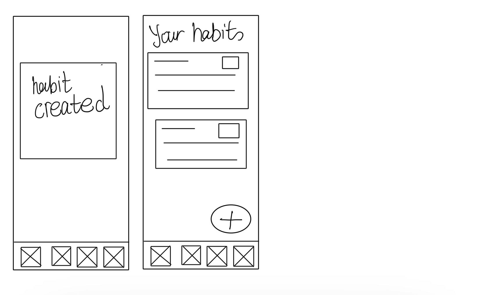
I started looking at a few of the most famous apps and the ones I got from the early questionnaire. I have got a few ideas, especially the ones that will solve the users' problems. I tried to make it as easy and fast as possible to add a habit but at the same they still have an option to customize it. The images below are the flow to add a habit. The rest of the features I added them in the digital low-fi wireframes only.
Digital wireframes and Prototype
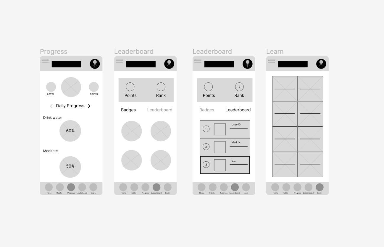
After finishing the paper wireframes, I used Figma to create the digital wireframes as shown in the image below. I added a few missing screens for the prototype below.

Here are the rest of the screens that were missing from the paper wireframes. These are a progress tab and a leaderboard tab. With the leaderboard tab, I added badges and I found out from the usability study that it is an issue. It probably should be somewhere else.
I then connected the screens to make a usable prototype focusing on the prompts I needed for the usability study. I found out it was a mistake while I was watching the users testing my prototype. I should have connected all the screens so that they could go back easily without getting stuck on a page. Here is the prototype.

Testing the Prototype

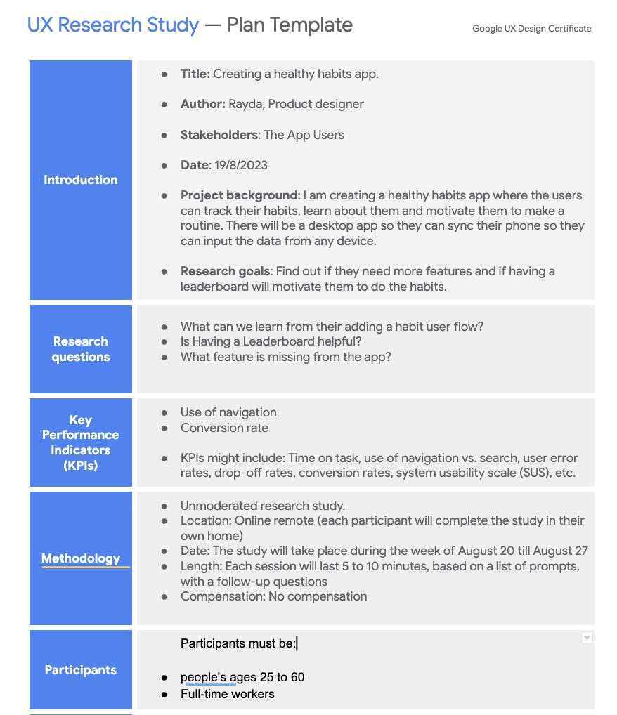
First, I needed to plan a usability study as shown below. This is a template from the UX design Course.
I then prepared the prompts in a document and sent it to them along with the Figma prototype link. The document is shown in the image below.


The usability study took a little bit more time than I had expected as I had been waiting for my friends to find the time to do it, Not complaining I am grateful that they took the time and participated in the study 😁.
Here is a spreadsheet for the notes I took for One participant to show this as an example. I will later analyze and synthesize the results. For privacy purposes, I deleted the data, and just left the "task completion" column.

Usability Study Results
I recruited 4 participants to participate in my Usability study. Almost all of them had the same issues with the prompts.
For Prompt 1:
The plus sign should take the users to the "add a habit" screen right away without opening the habits screen. This makes sense, I think cause I assumed that They wanted to see the available habits already on the list before adding a new one.
The habits popup should be more intuitive. I think with the UI design, this should be more obvious.
The flow was quite complicated, confusing and long just to add a habit. It needs to be simplified and give them an option to skip some steps. Use a more clear wording. For example, "With stats" was a little confusing I guess.
An idea for a new feature: To be able to organize the habits on the list.
For Prompt 2:
This prompt was a bit tricky, So two participants found it easily and answered the questions right away. However, it was confusing for the other two participants.
I think it wasn't clear and the wording was a bit off.
An idea for a new feature: Instead of showing the progress in percentage, It is better to be in cups for example for the water habit. More detailed progress measurement.
For Prompt 3:
All of them had difficulty finding the leaderboard after clicking on the leaderboard tab Since it is a tab inside the leaderboard tab. which I know now isn't a good choice.
Some of them said that they wouldn't use the leaderboard tab maybe occasionally just look at it.
Most of them liked the badges.
More features are needed for this: Day streaks and, the number of days required to get the badge.
Insights
I used Google's template for the insights as follows:

These insights were then divided into different priority levels. P0: the most important one, where the app won't function properly without. Then P1 and then P2. I categorized them as follows:

Iterating on low-fidelity designs

This is the last step in the second week. It is time to apply the changes needed for the app to be better.
Here is the link for the updated prototype.
I applied the insights as follows:
Added a customization screen before the home screen, so this will appear once when the user opens the app the first time. To ask whether they want the leaderboard or not.
Option to skip the ability to have a frequent habit.
Added a screen to determine the time of the day they want to do the habit.
Removed the badges from the leaderboard tab and added them to the profile page.
Changed The way the progress is calculated so instead of having them in percentages, I made the water in cups and meditation in minutes.
Changed "with stats" to "Track my progress"

Conclusion
Improving your app is a never-ending process. Always get feedback from your users to improve the user experience no matter what stage you are in the building process.
Thanks for reading! Stay tuned for the week 3 Article where I will be doing the mockups and building the high-fi prototype, i.e. my favorite part :D.